It’s Okay, Not To Be Okay
Logo Design, Branding
Created in 2016
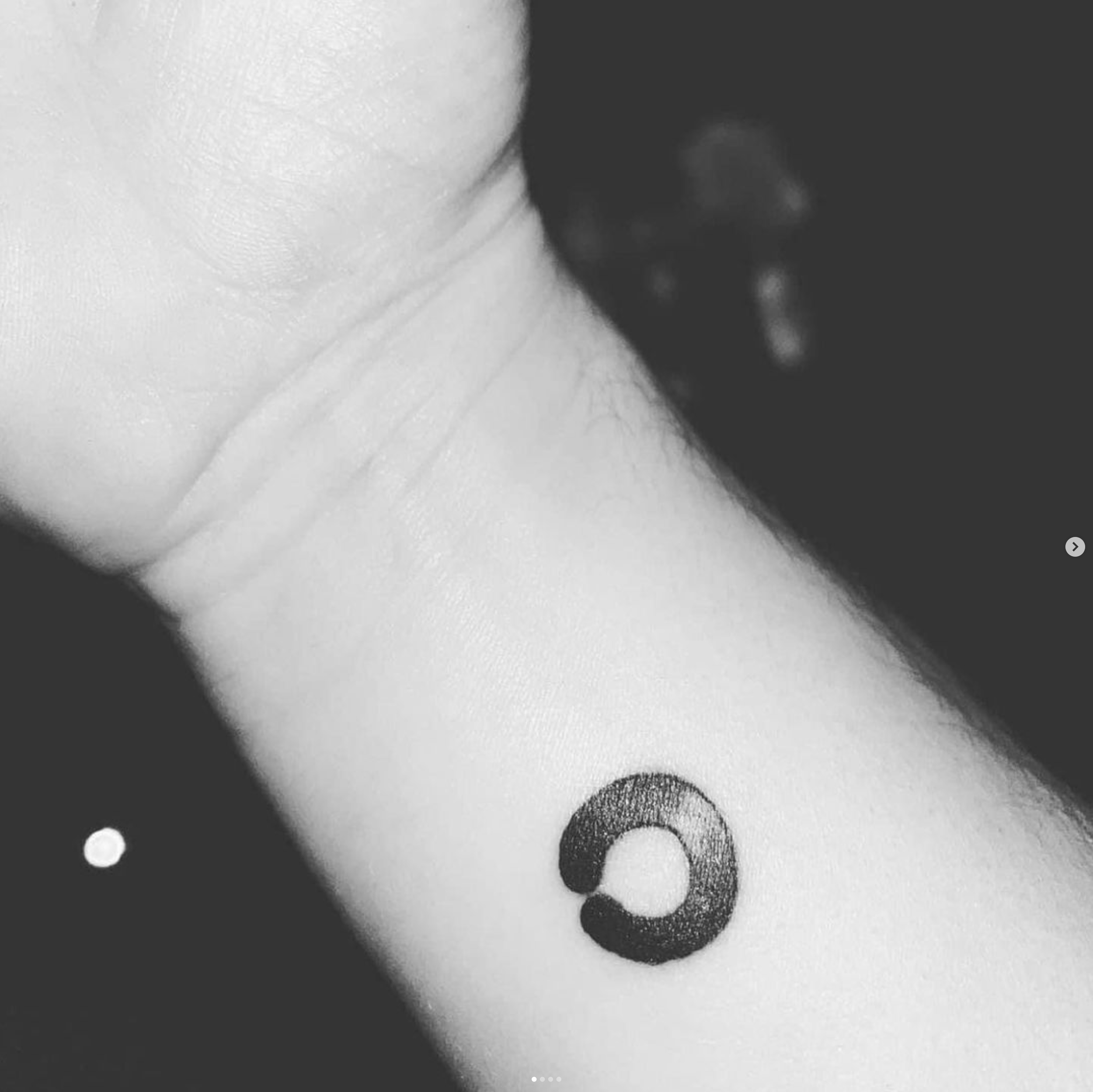
I created the logo for It’s Okay, Not to Be Okay to capture simplicity with a profound meaning.
The idea began with the "okay" hand gesture, as an obvious way to reflect the name, but I wanted to infuse it with deeper symbolism. The broken circle represents the imperfection of life and the breaking of stigma surrounding mental health. Within the negative space, the circle subtly forms a speech bubble, symbolising that it’s okay to speak up.
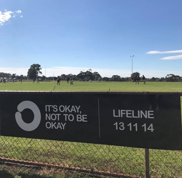
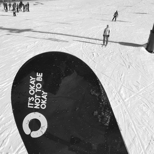
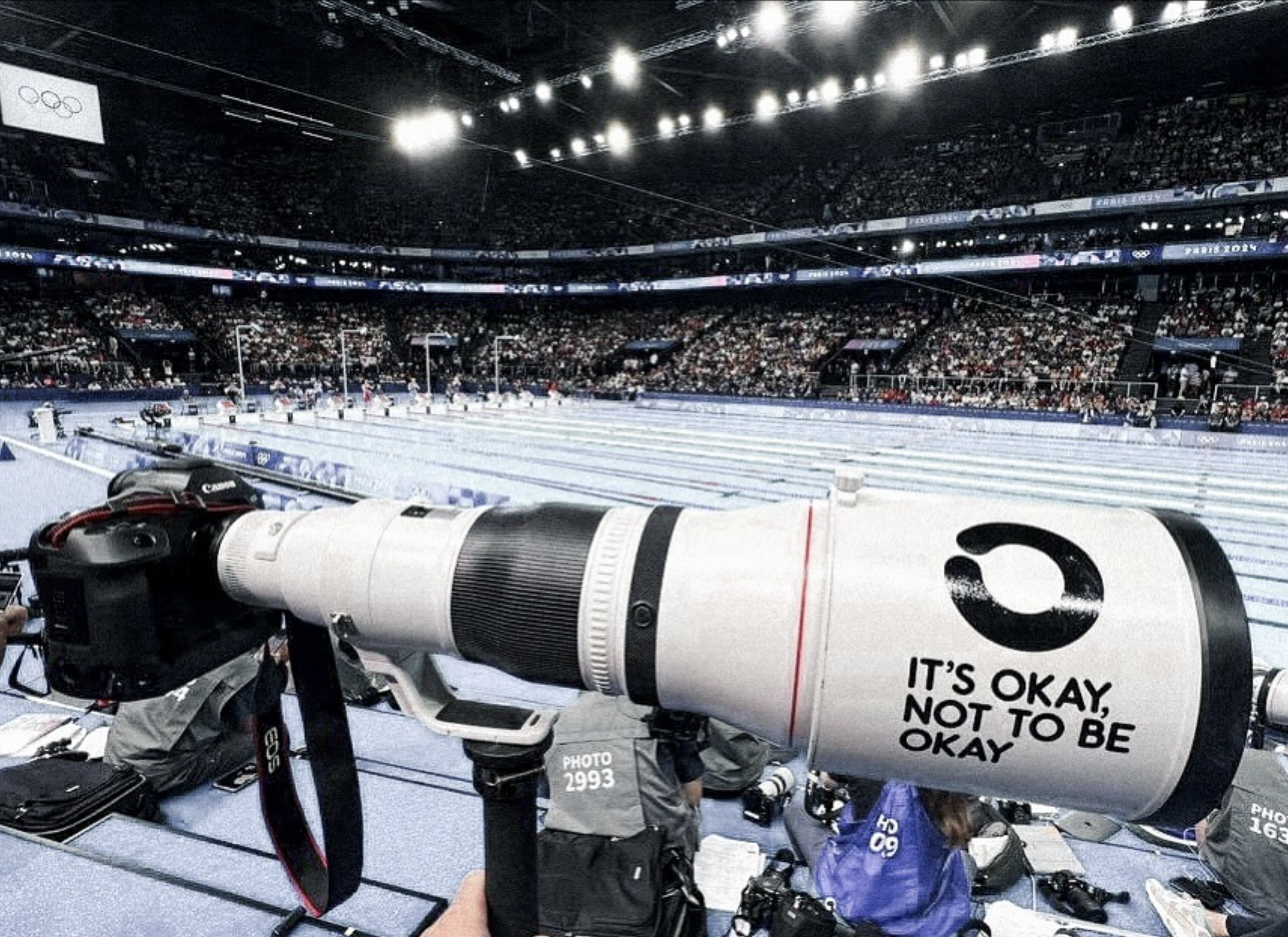
Now instantly recognisable and widely known, the logo has become a trusted symbol of connection, support, and hope.
BEHIND THE DESIGN:
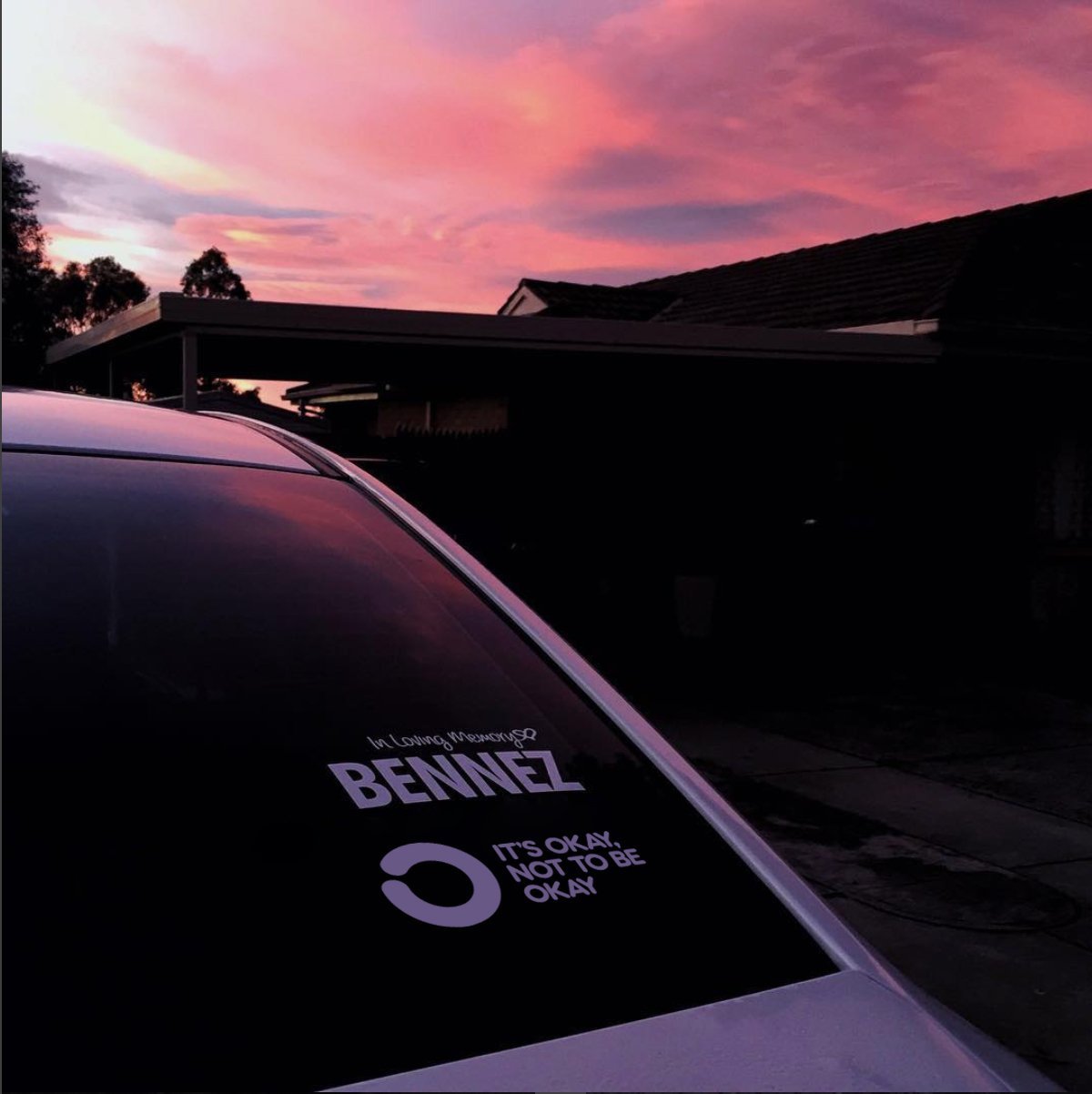
My longtime friend Ben took his own life in 2016. His wonderful family reached out not too long after, hoping to create something that would honour his memory and help others struggling with their mental health. I felt passionate about spreading the message they were trying to convey and set out to create a logo that would inspire others. I had no idea how big the organisation would grow, but I am so proud every time I see the logo – which is now almost every time I leave the house, and as far away as Mount Everest.
